
13 Mar Living Coral, PANTONE’s Color of the Year for 2019
For 20 years now PANTONE’s Color of the Year has impacted home design, fashion, packaging and brand visual identities. The colour is chosen based on “what is taith warmth and nourishment to provide comfort and buoyancy in our continually shifting environment.”
The golden orange shade emits the desired, familiar and energising aspects of colour found in nature, but clearly modern.
Why we love it
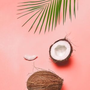
We like the connection and intimacy Living Coral brings in the color palettes it is a part of so much: an appealing accent shade, the colour also provides a striking contrast in relation to other colours, making them pop in a visual.
For 20 years now PANTONE’s Color of the Year has impacted home design, fashion, packaging and brand visual identities. The color is chosen based on “what is taking place in our global culture at a moment in time”.
There is a long process of trends analysis in areas like entertainment, travelling, art, materials & textures, new technologies, social media platforms or events that capture worldwide attention that goes into choosing it. In 2015 PANTONE’s Color of the Year was Marsala, then in 2016 Rose Quartz & Serenity, in 2017 Greenery and in 2018 Ultra Violet.
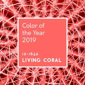
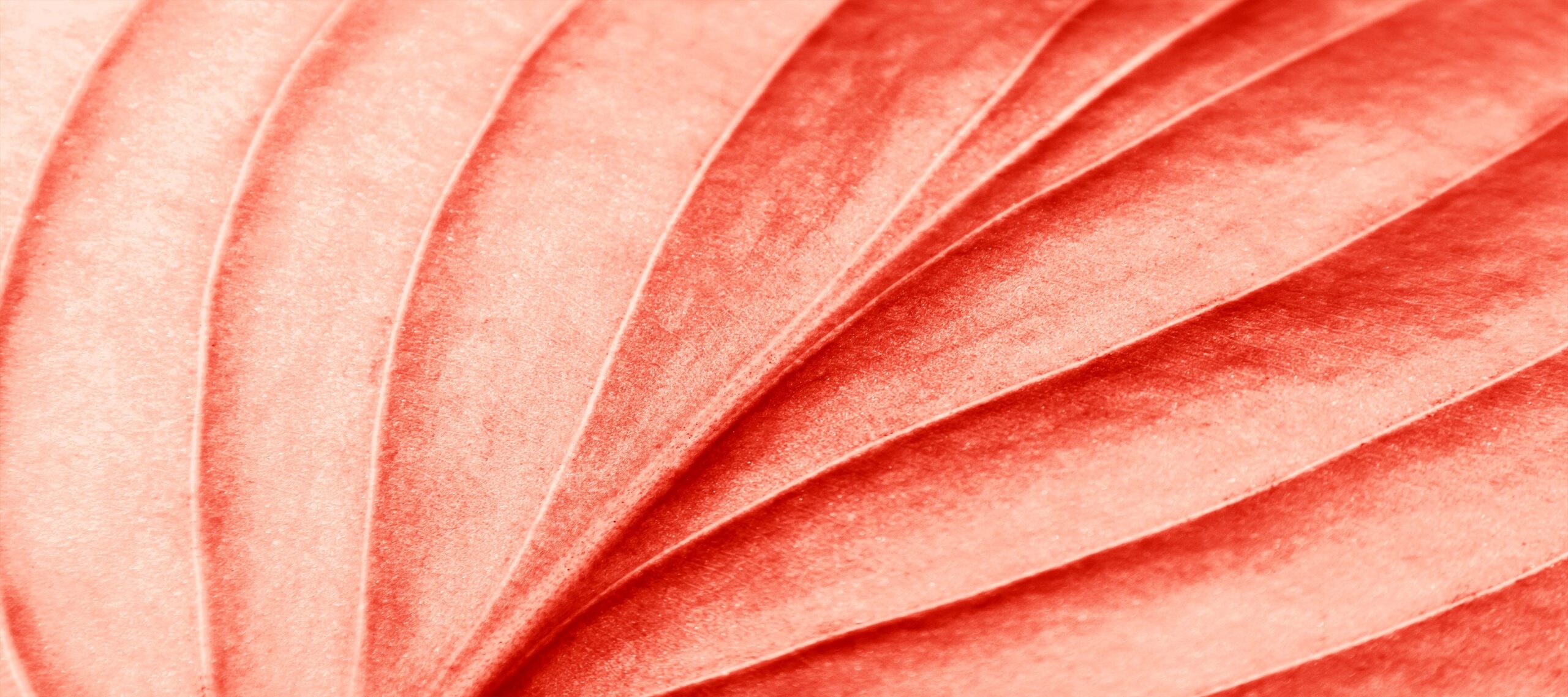
2019 brings PANTONE 16-1546 Living Coral
Living Coral is presented as tapping into our innate need for optimism and joyful pursuits. It is a lighthearted color with an engaging nature, sociable and spirited. As PANTONE introduces it: “Vibrant, yet mellow PANTONE 16-1546 Living Coral embraces us with warmth and nourishment to provide comfort and buoyancy in our continually shifting environment.”
The golden orange shade emits the desired, familiar and energizing aspects of color found in nature, but clearly modern.
Why we love it
We like the connection and intimacy Living Coral brings in the color palettes it is a part of so much: an appealing accent shade, the color also provides a striking contrast in relation to other colors, making them pop in a visual.
It creates immersive experiences exactly because its vibrations are so effervescent, so alive, captivating our attention in social media and digital design.
The search for the perfect shade
We pay a lot of attention in choosing the colors of the visuals we create as they resonate so deeply into emotions, and Living Coral is such a beautifully versatile shade.
As Leatrice Eiseman describes it: “Color is an equalizing lens through which we experience our natural and digital realities and this is particularly true for Living Coral, with consumers craving human interaction and social connection, the humanizing and heartening qualities displayed by the convivial PANTONE Living Coral hit a responsive chord.”
 Get inspired
Check out color palettes and more ideas on how to use Living Coral in our Pinterest Board here:
pinterest.at/51agency/pantones-color-of-the-year-2019-live-coral/
Sorry, the comment form is closed at this time.